CHIME
As part of the team at Jones Knowles Ritchie, I worked on the rebranding of Chime to redefine its place in the financial landscape. The 2024 rebrand was crafted to disrupt traditional banking conventions and make financial progress more accessible and intuitive. Our goal was to create a more inclusive, seamless experience without losing the bold, modern personality that Chime is known for. By delivering a brand identity that empowers users to take control of their financial journey with ease, we helped shape a new chapter for Chime—one that speaks directly to the evolving needs of today’s consumers.CHIME
STUDIOJones Knowles Ritchie
ROLE
Designer
SCOPE
Brand Identity
TEAM
ECD: Jason Little | CD: Jimmy Alleman
DESIGN: Daniel Roscha, Patricia Mitiko Morales, Taylor Woods, Mira Dandiker
STRATEGY: Scott Fogel, Cole McCloskey
COPY: Joe Schott, Madeline Masarik
MOTION: Kaitlyn Chandler, Griffin Keller, Isaac Riches, Andrew Stubbs Johnston
3D: Mat Brown, Abeselom Kavelashvili
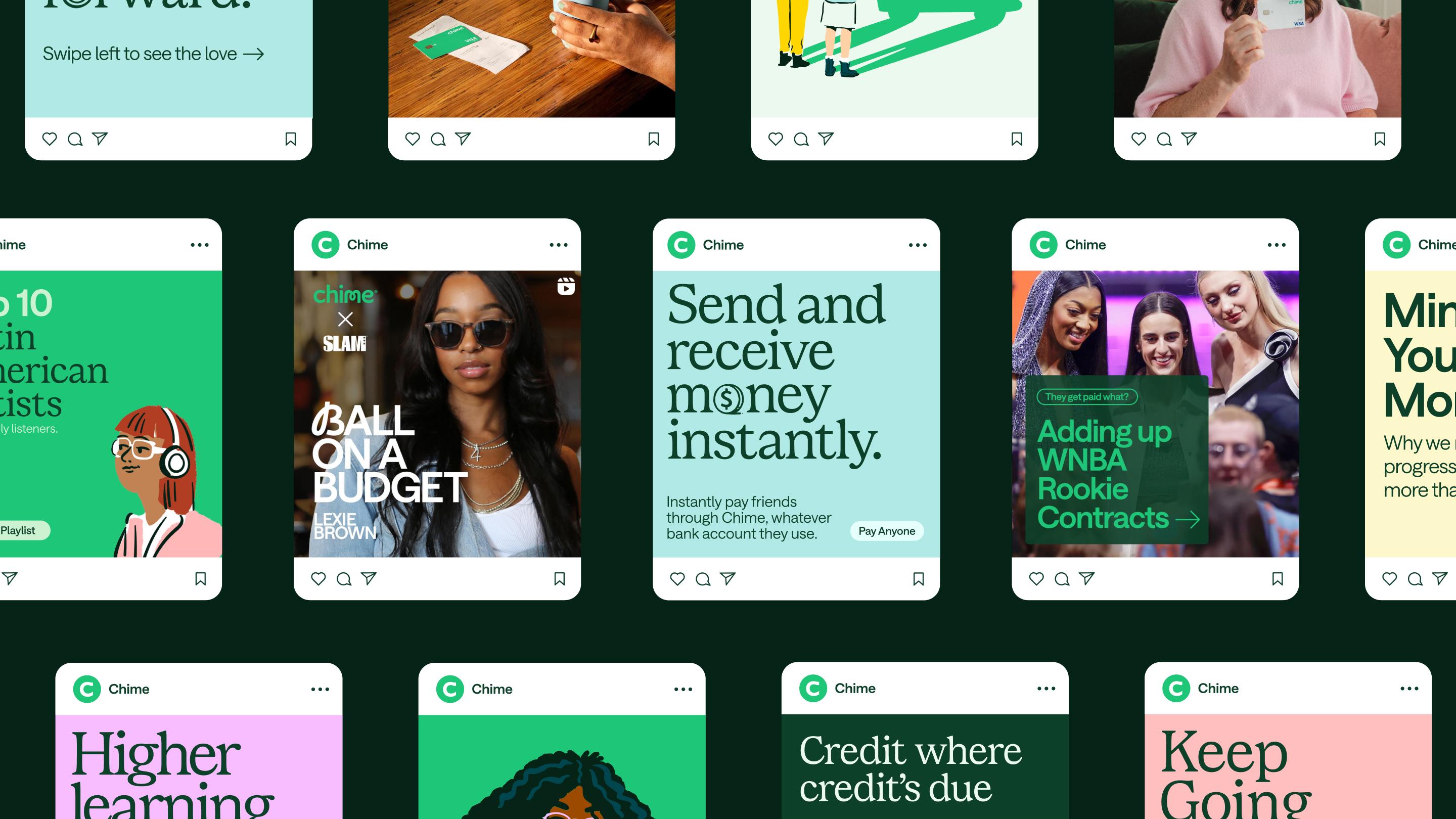
The design centers around the concept of a “Portal to Progress,” capturing the effortless way Chime’s customers can achieve financial growth. Chime’s green “portal” symbolizes its products, which are designed to ease financial management and simplify daily progress. By emphasizing the seamless integration between the card and app, the brand highlights how product use directly supports financial progress. By featuring everyday transactions through storytelling and photography, we underscore how small, routine actions can build toward meaningful progress, making the ordinary feel more inspiring.
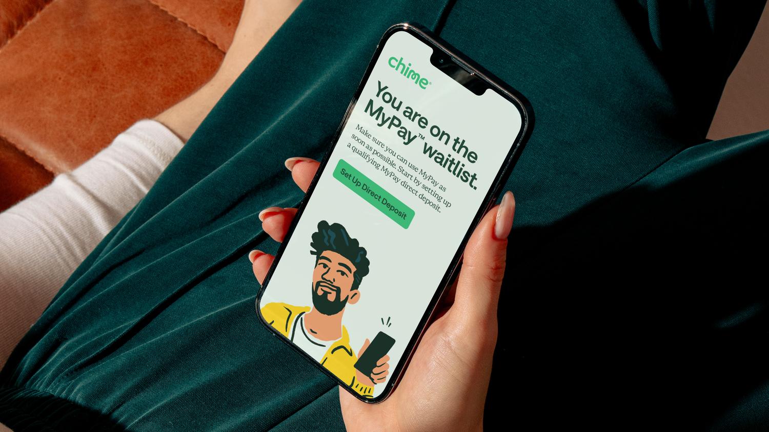
In collaboration with Marco Palmieri, we developed a series of illustrations and animations to infuse the brand with a more human, artistic, and approachable feel.The outdated vector style was replaced with fresh, hand-drawn visuals, giving the brand a distinctive and ownable identity. Our illustrations were designed to highlight and celebrate diversity. The move toward a more realistic style ensures the brand feel relatable and inclusive, resonating more deeply with Chime’s diverse community.
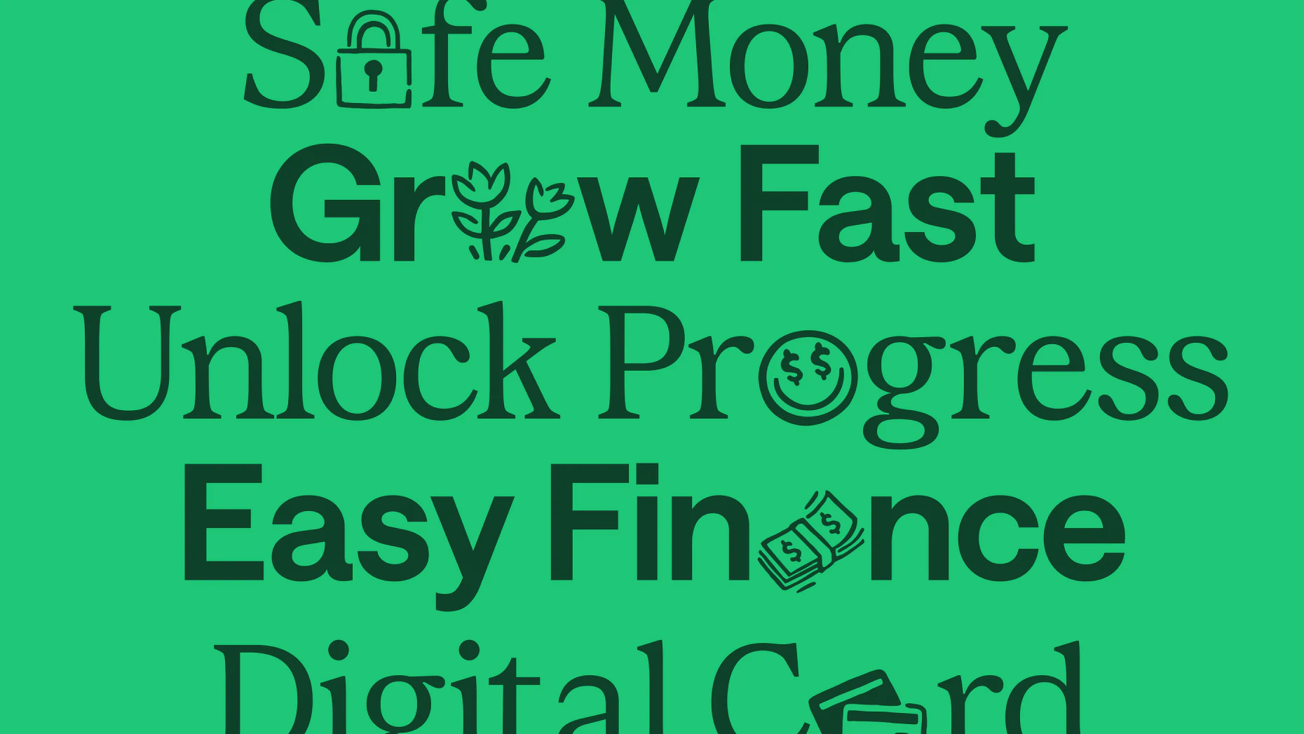
Chime Serif and Chime Sans were crafted in partnership with Colophon Foundry and Displaay to prioritize readability and contrast, all while communicating a sense of security, clarity, and trustworthiness. To inject personality into the brand, we introduced a unique twist by replacing select letters with custom pictograms or hand-drawn scripts, adding a human element that reflects Chime’s approachable and friendly character.